

Standard scope
This standard applies to:
- pennmedicine.org
- All Penn Medicine websites
- Penn Medicine mobile applications
- All Penn Medicine digital products
Overview
Content banners are typically used to:
- Introduce key topics or services: Provide high-level summaries to orient users to the subject matter.
- Supplement editorial content: Highlight related people, places, or details that enhance the story.
- Enhance visual storytelling: Incorporate images and layout structure that capture user interest and support narrative flow.
- Encourage exploration: Link users to deeper content, related topics, or next steps through contextual CTAs.
Use cases
The following table provides a summary of use cases for content banners. Visual examples for each banner type and a list of content elements are also provided.
Design System name
Banner-Page-Generic
8-col: 1 banner/row
Banner-ArticleSupplemental
8-col: 1 banner/row
Generic banner
The generic banner is a structured yet adaptable design pattern that can be reused across different page types.
The banner page generic combines elements such as:
- Background pattern
- Image
- Title
- Body copy
- Link


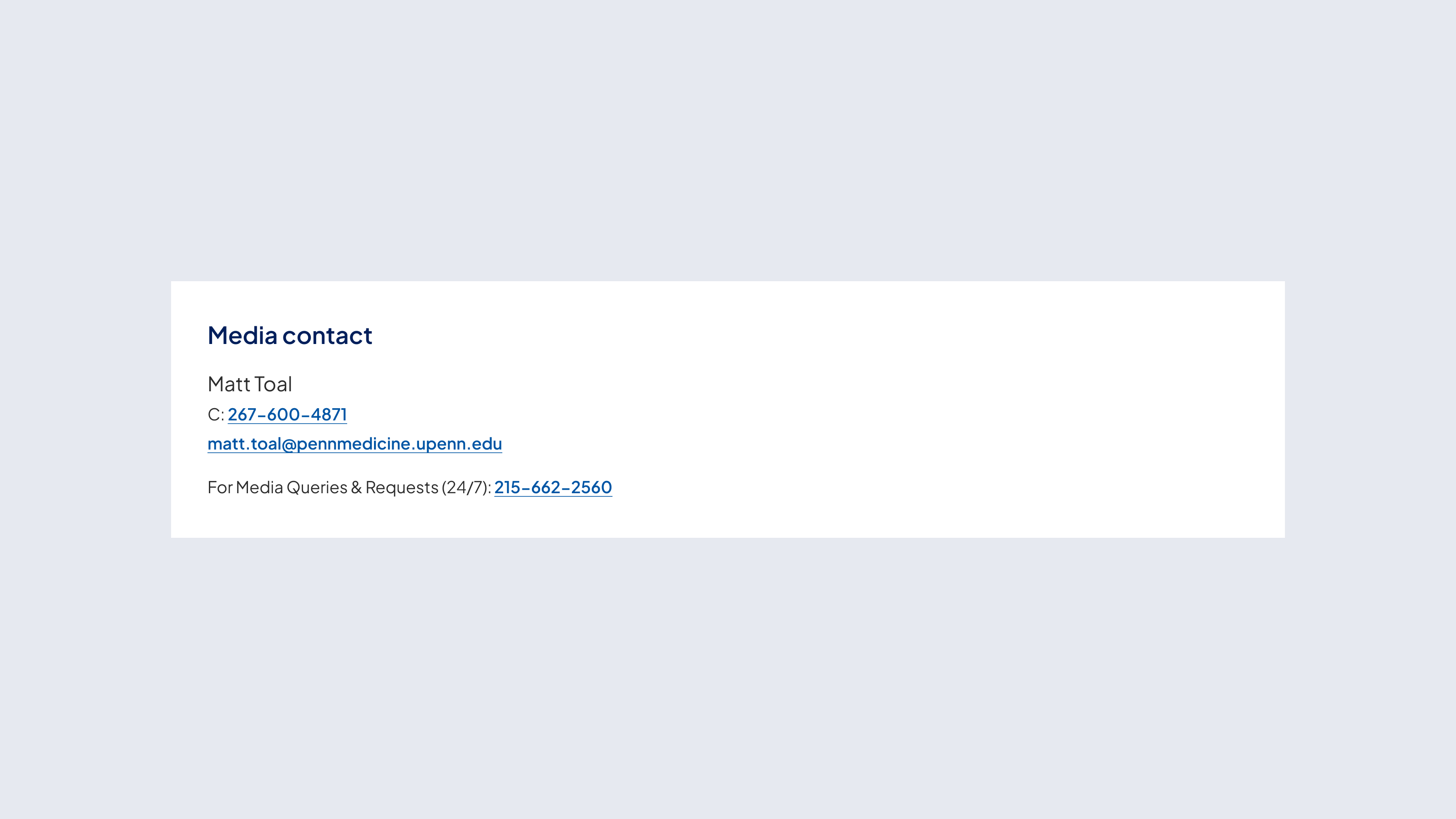
Article supplemental banner
The article supplemental banner consists of the following elements:
- Title: Clearly states the purpose of the banner (e.g. “Media Contact”, “Additional Resources”).
- Body copy: Provides supporting details, such as a contact person’s name or resource summary.
- Clickable phone number: Allows direct dialing for inquiries.
- Email link: Opens an email client to initiate communication.
- Supporting text: Adds contextual information such as availability or additional contact details.
Behavior
Interactive
- Interactive banners indicate interactivity solely through the presence of a text link, phone number or email address.
- The link appears as linked text and serves as the primary call to action.
- Phone numbers are clickable and initiate a call when selected.
- Email addresses open the default email client when clicked.
Customizable elements
Content banners offer a flexible structure, allowing for customization of content. The layout supports a variety of elements that can be toggled on or off to create a tailored experience. Below are the key components of the design.
Generic banner
Article supplemental banner
Guidelines (do’s and don'ts)

Do
- Use clear and concise language to maintain scannability.
- Use actionable language in the link text to encourage interaction with the user.
- Ensure image and text alignment remains visually balanced.
- Keep the supplemental content simple and concise to complement the main article content.
- Ensure phone numbers and email addresses are clickable for user convenience.

Don't
- Clutter the banner with excessive links. Limit to one, if possible, with bottom link always the primary call to action.
- Overload the supplemental banner with excessive information—keep it concise.
- Use multiple contact names within a single banner—limit it to one primary contact.
- Remove interactive elements when user action is expected.
Related resources
For designers: Visit the Designers section for access to component specs and Figma files.
For developers: Visit the Developers section for implementation details and to access the front-end code library in Storybook.
Contact
For more information about this standard, email: web-standards@pennmedicine.upenn.edu