

Standard scope
This standard applies to:
- pennmedicine.org
- All Penn Medicine websites
- Penn Medicine mobile applications
- All Penn Medicine digital products
Overview
Horizontal cards are typically used to:
- Provide information: Provides summaries of content, often with a link for further details.
- Display images: They can incorporate images, media, icons, and tags while maintaining readability.
- Organize content: Ideal for use cases where a wider format works better than a stacked vertical card.
- Make information scannable: Useful for text-heavy content, allowing users to quickly digest longer descriptions and multiple elements (title, body, image, CTA).
Use cases
The following table provides a summary of use cases for each horizontal card set type. Visual examples of each card set type are also provided.
Design System name
Card Set-Horizontal
8-col: 1 cards/row
Card Set-Locations
8-col: 1 cards/row
Card Set-Conditions
8-col: 1 cards/row
Card Set-Featured
8-col: 1 cards/row
Card Set-Locations
8-col: 1 cards/row
Card Set-Services
8-col: 1 cards/row
Card Set-Testimony
Slider-Testimony
Slider: max 5 cards in slider
8-col: 1 card/row
Slider: max 5 cards in slider
Card Set-Provider
Note: All content should always be dynamically generated from a trusted data source to the ensure credentials of the profiled individual.
8-col: 1 cards/row
Card Set-Listing-News
8-col: 1 cards/row
Card Set-Icon-Simple
Note: This is the only horizontal card option that allows for 2 cards per row.
8-col: min 4 and max 8 cards in slider
Horizontal card set
The general-use horizontal card may include several common elements
- Image (left or right placement)
- Tag, to classify the content
- Title
- Body copy
- Link to more information

The horizontal card set contains one or more cards and may include an optional independent title, description and link to additional details. All cards in the set should match the same properties (image, title, body, etc.) to maintain visual harmony and a consistent user experience.

Location card set
The location card includes visual tags and other content options:
- Image
- Tag to categorize the content
- Title
- Body copy
- Address
- Phone Number
- Tags (icon and text) to provide additional relevant information
- Link for more information

The location card set contains one or more cards and may include an optional independent title, description and link to view more locations. All cards in the set should match the same properties (image, title, body, etc.) to maintain visual harmony and a consistent user experience.

Condition card set
A condition card conveys information in text format using the following content elements:
- Title
- Body Copy
- Tag Label
- Tags
- Link to additional information
The condition card set contains one or more cards and may include an optional independent title and description. All cards in the set should match the same properties (title, body, tag label, etc.) to maintain visual harmony and a consistent user experience.

Featured card set
A featured card makes use of a limited set of elements to highlight key content including:
- Image
- Title
- Body copy
- Link
The featured card set contains one or more cards and may include an optional independent title and description. All cards in the set should match the same properties (title, body, tag label, etc.) to maintain visual harmony and a consistent user experience.
.png)
Location schedule card set
The location schedule card is action-focused and includes the following elements:
- Image
- Title
- Address
- Phone number
- Tags (icon and text)
- Button stack (primary and secondary)

The location schedule card set contains one or more cards and may include an optional independent title and description. All cards in the set should match the same properties (image, title, address, phone, tags, etc.) to maintain visual harmony and a consistent user experience.

Services card set
The services card is a simple card with two element options:
- Image
- Tags (icon and text)
Services cards are informative only and non-interactive.

The services card set contains one or more cards and may include an optional independent title, description and link to additional details.

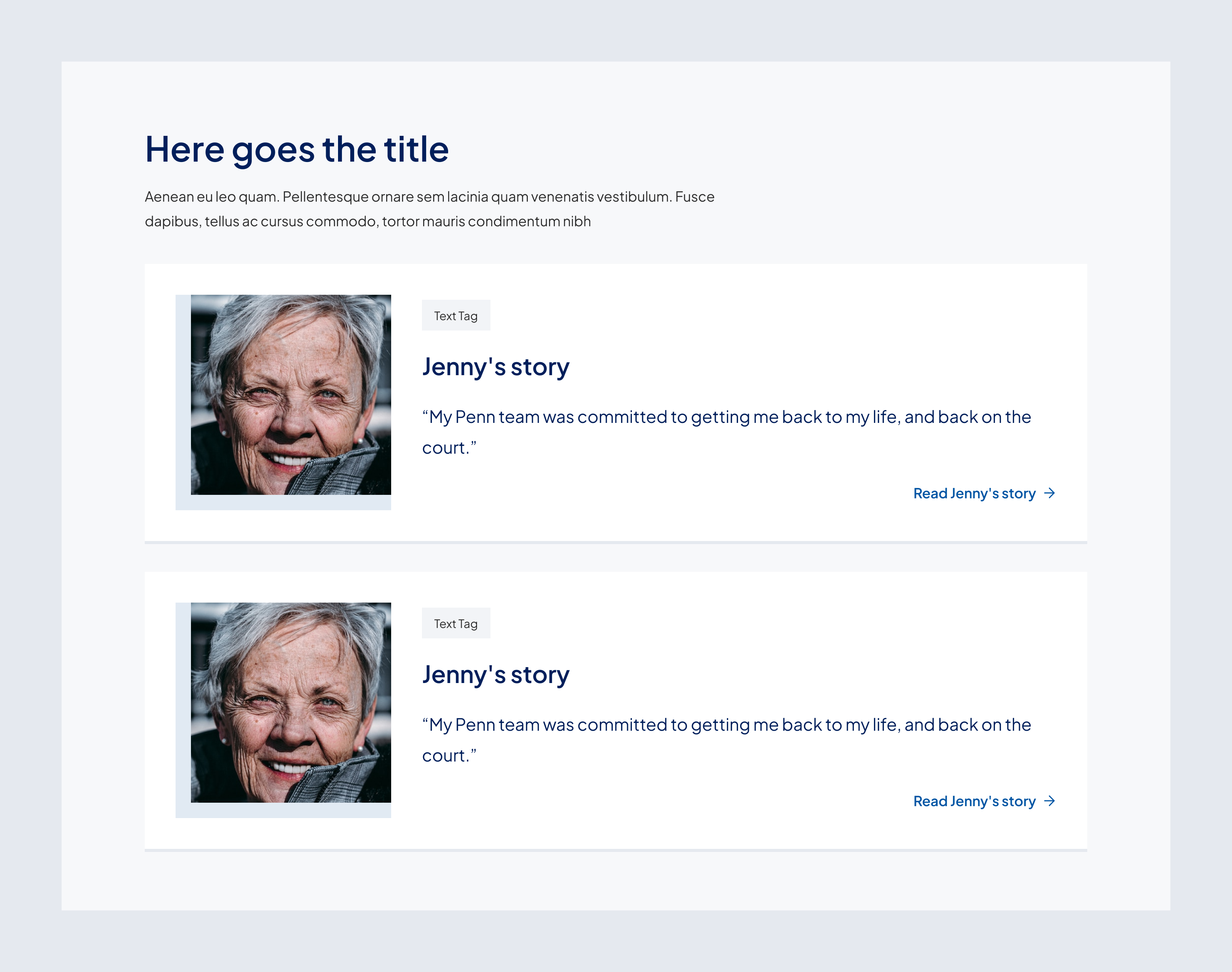
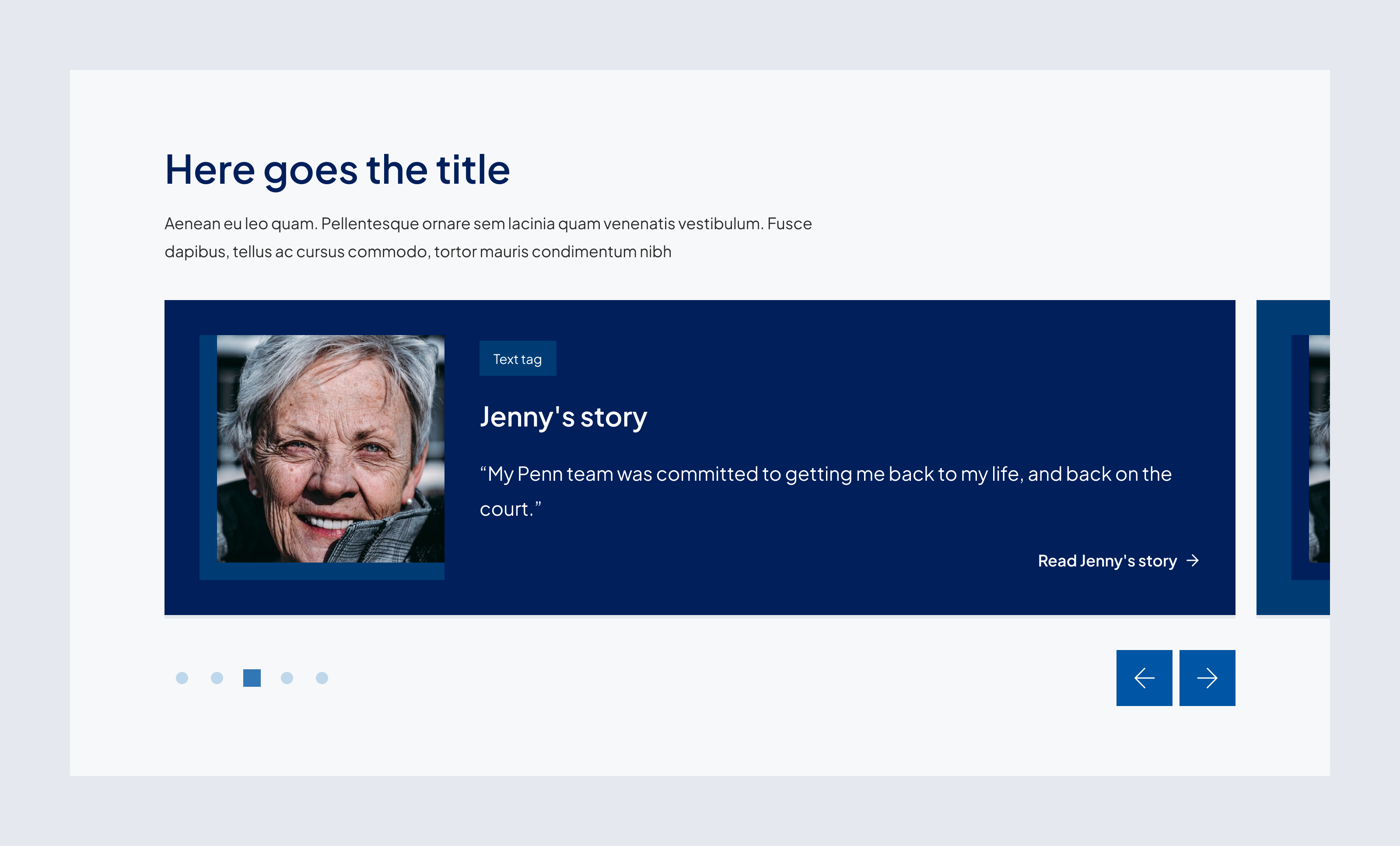
Testimony card set and slider set
The testimony card includes the following elements:
- Image
- Tag
- Title
- Body copy, usually a testimonial snippet
- Link
.png)
The testimony card set contains one or more cards and may include an optional independent title and description. All cards in the set should match the same properties to maintain visual harmony and a consistent user experience.
The testimonial card slider set displays up to 5 testimony cards in a carousel format. The slider set contains one or more cards and may include an optional independent title and description. All cards in the slider set should match the same properties to maintain visual harmony and a consistent user experience.
When there is more than one card in the slider set, the following elements will also be present, supporting automatic scrolling or manual navigation:
- Navigational arrows to allow users to cycle through testimonials
- Dot indicators to provide a visual cue for the number of testimonials
Providers card set
The provider card is always dynamically generated from a trusted data source to ensure the credentials of the providers, faculty or staff and includes the following elements:
- Image
- Image Tag
- Description
- Name
- Information icon indicating credential
- Rating tag
- Independent provider text, when applicable
- Tags indicating availability
- Location tag
- Description bullets
- Link
- Button stack

The providers card set contains one or more cards and may include an optional independent title, description and link to view more providers. All cards in the set should match the same properties to maintain visual harmony and a consistent user experience.

News search results card set
The news search result card at the molecule level is a self-contained component that combines elements such as:
- Image
- Image icon indicating media type, not applicable to text articles
- Tags to classify the news
- Title
- Body copy
- Link, only if external, otherwise the card is clickable
- Author and date

The news search results card set contains one or more cards and includes a heading summarizing the search results. All cards in the set should match the same properties to maintain visual harmony and a consistent user experience.

Simple icon card set
The simple icon card leads with right hand color-filled bar that may contain an icon and includes the following simple and limited content elements:
- Icon
- Title
- Body copy
- Link arrow

The simple icon card set contains one or more cards and may include an optional independent title, description and link to additional details. All cards in the set should match the same properties (icon, title, body, link arrow) to maintain visual harmony and a consistent user experience.

Behavior
Horizontal card
Interactive
nteractive cards feature a gray underline and must include a link as a call-to-action. The link is in the form of link text. Cards may contain multiple links within the body of the card but should also always include a link at the bottom to indicate that the card itself is interactive. Cards in a set must either all include or not include links.
Non Interactive
Non-interactive cards in our design system do not include a gray underline and do not feature any links as calls-to-action. These cards are purely informational and serve to display content without prompting user interaction.
Location card
Interactive
- Must include a primary action link (e.g., “Learn about location”).
- Clickable address directs users to maps for navigation.
- Clickable phone number allows direct dialing for convenience.
- Icons for available services should provide quick recognition and improve scanability.
Non-interactive
- Displays available services without interactivity.
- No hover state changes.
Condition card
Interactive
- Features a gray underline and must include a CTA link.
- Clicking the CTA (“Learn more”) directs users to the full condition/treatment page.
Non-interactive
- Displays available services without interactivity.
- No hover state changes.
Featured card
Interactive
- Uses a gray underline and a CTA link.
- Clicking the CTA directs users to further details.
Non-interactive
- Serves as a static display without hover effects or clickable elements.
Location schedule card
Interactive
- Uses a grey underline that turns blue on hover.
- Clickable address directs users to maps for navigation.
- Clickable phone number allows direct dialing.
- CTA buttons provide options for further engagement (e.g., scheduling an appointment).
- Icons indicate available services.
Non-interactive
- Displays location and schedule details without interactivity.
- No hover state changes.
Services card
Interactive
- Can include a CTA link for expanded service descriptions.
Non-interactive
- Displays available services without interactivity.
- No hover state changes.
Testimony card
Interactive
- Clicking the CTA (“Read More”) directs users to the full patient story.
- In slider format, arrows and pagination allow users to navigate through multiple testimonials.
Non-interactive
- Displays static testimonial content without interactivity.
- No hover state effects.
Providers card
Interactive
- Features a gray underline and must include a CTA link.
- Clicking the CTA (“View Profile”) directs users to the provider’s full profile.
- Appointment buttons allow users to schedule an appointment directly.
Non-interactive
- Displays provider details without action elements.
- No hover state effects.
News search result card
Interactive
- Clicking the headline navigates to the full article.
- In search results, the card adapts dynamically based on filters and sorting.
Non-interactive
- Displays static news content without interactivity.
- No hover effects or dynamic behavior.
States
Hover State: The gray underline transitions to dark blue, and the card's image displays a blue overlay to reinforce its interactivity. For the news search results card, the article title becomes underlined to indicate interactivity. For providers cards, hovering over the information icon amended to the name will reveal the credentials of the individual.
Non-interactive cards do not have a hover state, maintaining a static appearance to indicate they are purely informational.
Customizable elements
The variations of horizontal cards and card sets provide a flexible structure, allowing for customization of content. Elements that can be toggled on or off to create a tailored experience. Below are the key components of the design for each horizontal card set type.
Horizontal card set for general use
Location card set
Optional
Condition card set
Optional
Featured card set
Optional
Location schedule card set
Services card set
Optional
Testimony card set and slider set
Providers card set
News search result card set
[Month] [DD] [YYYY]
Simple Icon card set
Guidelines

Do
- Ensure all required elements are present.
- Make links clearly visible and accessible.
- Keep the title, body copy, and description brief but informative.
- Maintain a consistent structure when using multiple cards together.
- Maintain a consistent layout across all location cards
- Ensure addresses and phone numbers are clickable for easy access
- Use icons (and text) to enhance scanability without overwhelming the card.

Don't
- Overload the card with excessive text or other elements.
- Use vague icons.
- Use more than one link on condition cards unless absolutely necessary.
- Overuse the featured card on a single page—it should be a highlight.
- Alter the height of the card manually.
Related resources
For designers: Visit the Designers section for access to component specs and Figma files.
For developers: Visit the Developers section for implementation details and to access the front-end code library in Storybook.
Contact
For more information about this standard, email: web-standards@pennmedicine.upenn.edu