Forms

Forms are used to collect information from users and typically include text input fields, radio buttons, submission buttons and links. Multiple-step forms include navigation elements to help the user progress through steps to complete data-rich input forms. Upon submission, single-step forms display the submitted content as a confirmation to the user. Multi-step forms first allow the user to review and edit their input and then displays the submitted content as confirmation.

Standard scope

This standard applies to:

  • pennmedicine.org
  • All Penn Medicine websites
  • Penn Medicine mobile applications
  • All Penn Medicine digital products

Overview

Forms are typically used to:

  • Gather user contact information: Queries users for contact information and other data for subsequent follow up action.
  • Support task completion: Prompts user through a logical progression to provide the necessary information to complete and submit the form.
  • Provide feedback: A confirmation allows the user to validate the information submitted and may include guidance for next steps.

Use cases

The following table provides a summary of use cases for forms. Visual examples of each form type are also provided.

Note that in most cases, the form will follow a hero with heading, subheading and other text to introduce the form, provide guidance or confirm submission with a thank you message.

Form type
Design System components
When to use
Super form
Super Form
Provided in the design system to demonstrate the possible use of all form field components. To learn more about form fields explore web standards for interactions and controls.
Single step form
Form-Content
Form-Footer
Used for simple requests, registration or to sign up for a promotion when there is minimal information to collect. The form displays all the information the user will need to provide in a single view. Upon submission, the user views the completed form as their confirmation.  Note that other fields from the super form can be added, if needed.
Multi-step form
Form-Stepper
Form-Content
Form-Footer
Used when more extensive user information is required and can be clearly delineated into steps.  The form displays with navigation to help the user progress through the information collection steps.  Upon completion, the user views the completed form as their confirmation. Note that other fields from the super form can be added, if needed.

Single step form

The single step form can include the following elements:

  • Text field
  • Date field
  • Phone number field
  • Text area
  • Radio buttons
  • Checkboxes
  • Dropdown
  • Submit Button
  • Footer Link
  • Confirmation

The single step form confirmation appears when the user submits the form. The form updates to show what was submitted as a confirmation, with the footer link now guiding the user to a next step of their digital journey.

Multi-step form

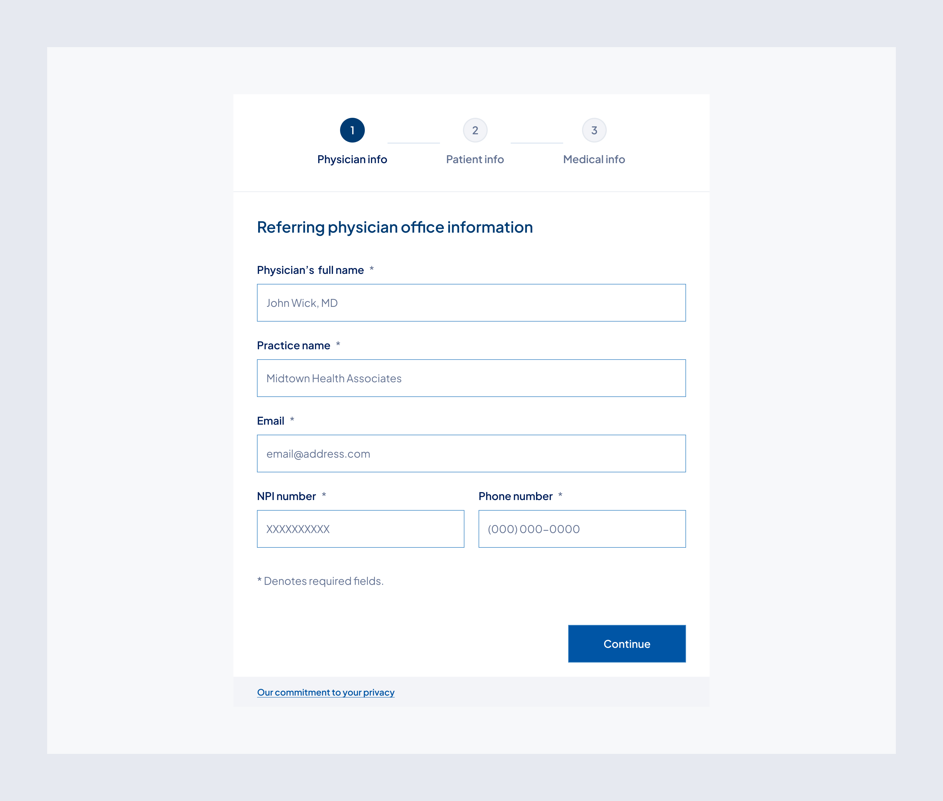
The multi-step form can include the following elements:

  • Step indicator with labels
  • Text field
  • Date field
  • Phone number field
  • Textarea
  • Radio buttons
  • Checkboxes
  • Dropdown
  • Submit Button
  • Footer Link
  • Review page
  • Confirmation page

The multi-step form confirmation appears once the user completes all the steps and clicks to continue to review, the form updates to show what was submitted for the user to validate and includes the ability to edit original inputs.

When the user submits the form, the page updates to show what was submitted as a confirmation, with the footer link now guiding the user to a next step.

Behavior

Interactive

Interactive form elements help guide users through the form and confirm their input.

  • Input fields highlight on focus to indicate where users are typing.
  • Radio buttons show selected state clearly when an option is chosen.
  • Buttons change appearance on hover and click to show they’re active.

Non Interactive

Non-interactive form elements display information without allowing changes.

  • Review page: all fields are read-only but editable via “Edit” buttons
  • Confirmation page: is non-interactive and serves as a record of submission

Error States

Error states help users understand when something has gone wrong and how to fix it.

  • Field-level errors:
    When a user enters invalid or incomplete information, the input field will:
  • Display a red border
  • Show an error icon
  • Include a helpful message below the field (e.g., “This value is invalid” or “This date is invalid”)
  • Page-level errors (submission failure):
    When the form cannot be submitted due to a technical issue, a global message displays below the primary action button.
  • Example: “Something went wrong. Please try again later.”
  • This message persists until the user attempts to resubmit.

Customizable  elements

Forms offer a flexible structure, allowing for customization of content. Below are the key components of the design.

Element
Required/Optional
Guidelines
Specs
Text field
Optional
Use full-width or half-width, depending on the aesthetics and the expected length of the response.
Write clear, descriptive labels and mark all required fields with an asterisk (*).
Placeholder text should suggest input.
Varies depending on data requirements for each input field.
Date field
Optional
Use for collecting dates
Standard format MM/DD/YYYY
Phone number field
Optional
Use for collecting phone numbers
Text area
Optional
Use when users need to enter multi-line text
Varies depending on data requirements for each input field.
Radio buttons
Optional
Use for selecting a single option.
Write clear, descriptive labels and mark all required fields with an asterisk (*).
Varies depending on user information needs.
Checkbox
Optional
Use when users need to select multiple options or acknowledge information.
Dropdown
Optional
Use when users need to select a single option from a large list.
Submit button
Required
Use “Submit” to complete the form on the final step.
Max 6 characters, always “Submit”
Form footer link
Required
Labeled “Our commitment to your privacy” to reassure users
Recommend max 30 chars
Confirmation page
Required
Display back the information they have submitted for peace of mind.
Varies based on user input.

Multi-step forms will also include the following elements:

Element
Required/Optional
Guidelines
Specs
Step indicator
Required
Required on a multi-step form.
Completed steps: Green with checkmark
Current step: Highlighted in primary blue
Upcoming steps: Shown in secondary blue
Back button
Required
Review page
Required
Display back the information they have submitted for peace of mind before submitting.
Edit buttons should be next to each step of the form title.
Varies based on user input.

Guidelines (do’s and don’ts)

Do
  • Use clear, plain-language labels.
  • Indicate required fields with an asterisk (*).
  • Show validation errors inline and contextually.
  • Break long forms into steps, if needed.
  • Minimize required input and avoid overwhelming the user.
  • Use mobile-friendly input patterns (e.g., numeric keypad for phone fields).
  • Provide a final confirmation.
Don't
  • Rely on placeholder text instead of labels.
  • Allow form submission with incomplete or invalid data.
  • Surprise users with hidden requirements or multiple mandatory steps without warning.

Related resources

For designers: Visit the Designers section for access to component specs and Figma files.

For developers: Visit the Developers section for implementation details and to access the front-end code library in Storybook.

Contact

For more information about this standard, email: web-standards@pennmedicine.upenn.edu

Last updated

Date
Version
Description
05/01/2025
1.0.0
Initial Release