Standard scope
This standard applies to:
- pennmedicine.org
- All Penn Medicine websites
- Penn Medicine mobile applications
- All Penn Medicine digital products
Overview
Interactions and controls are typically used to:
- Guide users: Clearly communicate available next steps.
- Trigger user action: Lead users to take action.
- Gather information: Prompt users for data in accurate formats.
- Provide options: Make it easy for users to understand, refine and make choices.
Use cases
Each interaction or control serves a specific purpose and should be used consistently across the digital ecosystem.
Design System name
Button
Icon Button
Link
Hyperlink
Small Tag
Service Tag
Chips items
Chips tags (Filter tags)
Chips as dropdown (Filter dropdown)
A to Z Filter item
Filter A to Z
Inputs
Dropdown items
Dropdown
Dropdown with Sections
Search input
Calendar slots
Radio Stack
Checkbox Stack
Slider
Toggletip
Pagination
Radio Button
Checkbox
Switch
Radio buttons are best used when asking users to make a single selection.
Checkboxes are used to allow users to select multiple items or acknowledge information
Use the switch when the intended effect is to immediately change something on the screen from a default state, such as form options or language
Button and Icon Button
There is always a primary button component and there may also be a secondary button.
The button component includes the following elements:
- Left icon
- Right icon
- Text

The icon button is a simple design with one element:
- Icon

Links and Hyperlinks
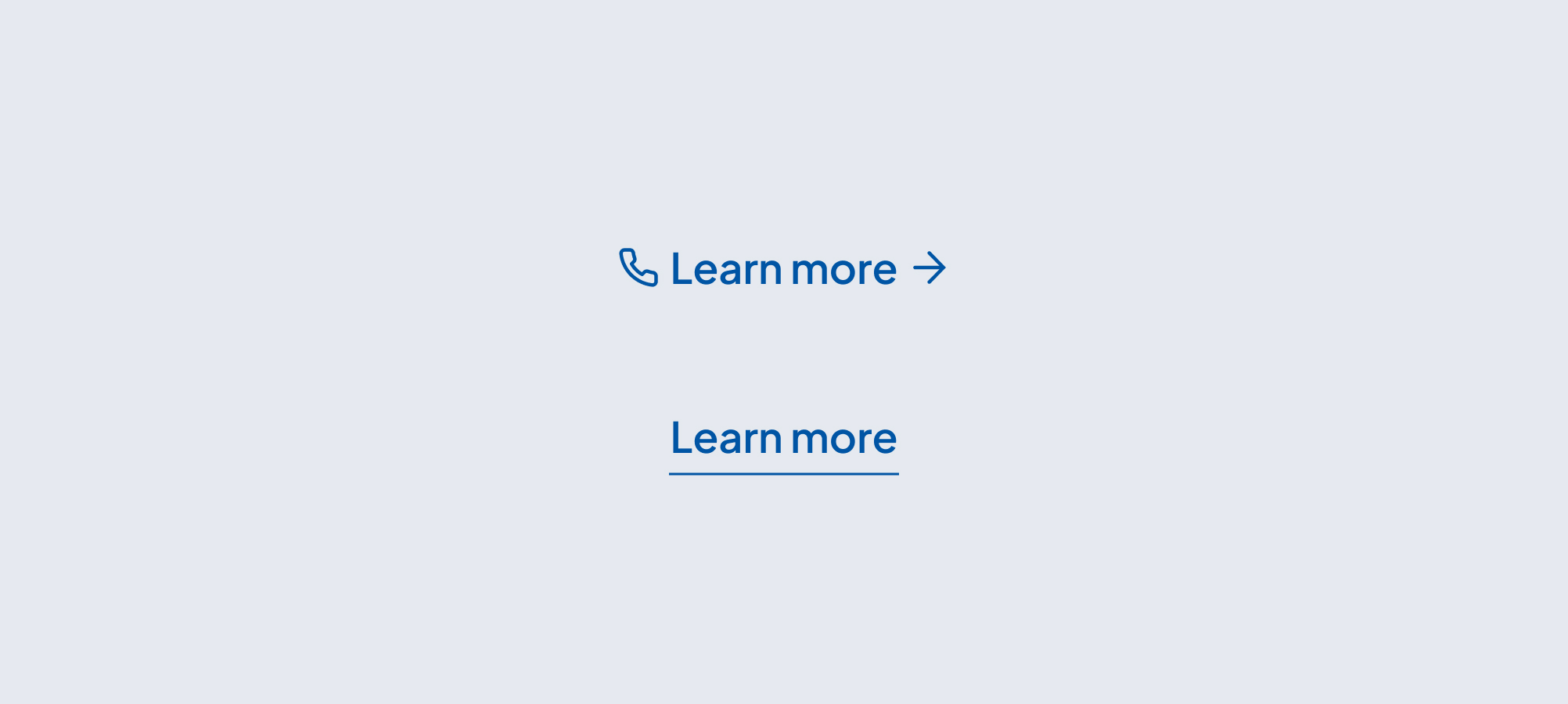
Links may include the following elements:
- Left icon
- Right icon
- Text
Hyperlinks include the following elements:
- Text
- Underline

Tags
Tags may be in the form of text or may include icons to denote a service or category.
The text tag, referred to as the Small Tag in the design system, includes the following elements:
- Text
- Rating number
- Stars rating
- Counting number


Service tags include the following elements:
- Icon
- Text
- Pride Pattern
- Tool Tip

Form fields
Form fields include the following elements:
- Inputs (Text General, Text Area, Email, Phone Number, Date & Password)
- Label
- Asterisk (indicating required field)
- Tooltip
- Text Field
- Input Icon
- Show/Hide icon
- Dropdown
- Dropdowns
- Label
- Asterisk (indicating required field)
- Tooltip
- Sections
- Text
- Search inputs
- Text
- Information icon
- Calendar slots
- Radio buttons
- Check Boxes
- Slider
- Toggletip
For form layout and use options, refer to Forms.
Filters
Filters may utilize chips or A to Z filtering options. This design system includes standard chips, chips with dropdown, and chips as filter tags.
Chips include the following elements:
- Chip Button text
- Chip Tag
- Chip Tag Label
- Chip Tag Button text

- Chips dropdown include the following elements:
- Dropdown Button text and chevron
- Dropdown search bar
- Text - available option for each dropdown

Filter A to Z includes the following elements:
- Label - topical or category (for desktop)
- A to Z filter buttons (for desktop)
- Topical search A to Z (for mobile)

A to Z desktop

A to Z mobile

A to Z mobile open

A to Z mobile letter selected
Controls
Controls include the following elements:
- Radio buttons
- Arrow controls
- Pagination elements
- Checkboxes
- Switches
Radio buttons are best used when asking users to make a single selection.

Arrow controls include a link with icon and they serve two functions. First, they help users operate sliders. Arrow controls also help users navigate back and forth on pages that require pagination.

Pagination elements are individual components that make up a pagination control, allowing users to navigate through sets of content that are divided into discrete pages.

Checkboxes are best used for situations where you are providing users the ability to select multiple options.

Use switches when the intended effect is to immediately change something on the screen from a default state, such as form options or language.

Behavior
Interactive
- Clickable elements (like buttons, chips, tags, and links) should provide clear visual feedback when hovered, focused, or pressed.
- Keyboard navigation must be supported for all controls, including tabbing through inputs, triggering buttons with Enter or Space, and using arrow keys where applicable.
- Form inputs should validate on submission and show real-time errors or guidance where possible.
- Chips and filters should update content immediately or show that an update is in progress.
- Pagination and carousels should provide clear next/previous behavior and not reset user context unexpectedly.
Non Interactive
- Non-interactive elements (like static text or containers) should be visually distinct from interactive ones and never trigger unexpected behaviors.
States
- Disabled states should be clearly styled and used only when necessary (e.g. preventing submission until required fields are complete).
- Loading states (e.g. spinners or skeletons) should be used to indicate background activity, especially for actions like filtering, submitting, or searching.
Customizable elements
The interaction and control elements offer a flexible structure, allowing for customization of content. The layout supports a variety of elements that can be toggled on or off to create a tailored experience. Below are the key components of the design.
Buttons
Links
Tags
14 px, Bold for logo
16px height for stars rating
15px, Regular for counting number, surrounded by parenthesis
Form fields
Text field
Use Text areas for longer responses like comments.
Dropdown inputs
Filters
Standard Chips
Dropdown Chips
A to Z filtering
Controls
Guidelines (do’s and don’ts)
Do
- Do limit characters in button text to 2 lines maximum.
- Do use the arrow icon on buttons that take users to an external website.
- Limit the use of buttons to no more than 2 buttons on each component, i.e., a primary and secondary call-to-action (CTA) button.
- When using 2 buttons for contacting and scheduling, make scheduling the primary button.
- Do limit any text, logo and service tags to 22 characters and 1 line of text per tag.
- Do keep text and no container tags on one line.
- Do follow these color guidelines for service tags, in order to meet typical user expectations.
- Use the neutral color for an icon serving informative purposes.
- Use the green color for indicating availability.
- Use the red color to indicate non-availability or error items.
- Do use plus/minus icons next to link to expand or compress the number of items shown in the organism
- Do use the arrow icon when the link takes users to other pages on the website
- Do use an underline when a link does not use any icons
- Use text inputs when you are seeking an open-ended response.
- When using the chip as a filter button, do show the label with a single selected result. When more than one filter is selected, show a multiple results icon next to the button text.
- When using chips as filter tags, do consider using the radio button to communicate to the user that the tag will be for filter selection.
- Do use checkboxes when you want a user to select multiple options.
Don't
- Don’t use the arrow on the primary and secondary buttons.
- Avoid using the call-to-action button on components other than page heroes, location cards or provider cards.
- Don’t overextend characters on tags
- Do keep text and no container tags on one line
- Don’t use the arrow icon when the link takes users to a section of the same page that they are currently on.
- Don’t write link text that is longer than 2 lines.
- Don’t use text inputs when the response you require is limited to a pre-defined set of options. Instead, use a dropdown input.
- When using the chip as a filter button, don’t hide the selection or selections.
- Don’t use radio buttons when you want a user to select multiple options.
- Don’t use checkboxes when you want a user to select only one option.
Related resources
For designers: Visit the Designers section for access to component specs and Figma files.
For developers: Visit the Developers section for implementation details and to access the front-end code library in Storybook.
Contact
For more information about this standard, email: web-standards@pennmedicine.upenn.edu