Standard scope
This standard applies to:
- pennmedicine.org
- All Penn Medicine websites
- Penn Medicine mobile applications
- All Penn Medicine digital products
Overview
Heroes are typically used to:
- Grab attention: Makes a bold statement with compelling visuals or headlines.
- Reassure users: Confirms that users have come to the right place.
- Improve user experience: Clearly orients users on what to expect.
- Guide users toward action: Features options like clicking a button, signing up, or exploring more.
- Support brand identity: Incorporates visual elements like shields, wordmarks and photography styles.
Use cases
Each hero variant is designed to support a specific user task or content type, but all are built from a shared set of components to ensure consistency across the design system. The following table provides a summary of use cases for heroes. Visual examples for each hero type and a list of content elements are also provided.
Design System name
Hero-Home
Hero-Shield
Hero-FindADoc
Hero-Search
Hero-Conditions
Hero-Image
Hero-Provider
Hero-Locations
Hero-Article
Hero-Callout
Hero-Underline
Hero-Simple
Hero home
The home page hero layout is flexible and includes the following elements:
- Title
- Body text
- Search
- Image
- Text tag
- Background design

Example with background design.

Hero shield
The shield hero includes the following elements:
- Title
- Body text
- Link
- Search
- Image
- Background design

Hero find-a-doc
The find-a-doc hero includes the following elements:
- Title
- Body text
- Image
- Background design
- Search

Hero underline
The hero with underline includes the following elements:
- Title
- Body text
- Button
- Background design
- Underline design

Hero search
The hero for search includes the following elements:
- Title
- Search
- Background design

Hero conditions
The conditions hero includes the following elements:
- Title
- Body text
- A-to-Z filters
- Search


Hero provider
The provider hero includes the following elements:
- Image
- Eyebrow
- Title
- Body text
- Rating tag
- Text tags
- Services tags
- Icon
- Link
- Buttons
Default and scrolled layout options are available.
Default

Scrolled

Hero locations
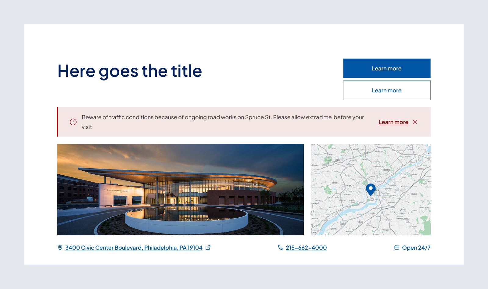
The locations hero includes the following elements:
- Title
- Buttons
- Alert banner
- Image
- Map image
- Links

Hero article
The hero for articles includes the following elements:
- Breadcrumb
- Image
- Text Tags
- Title
- Subtitle
- Author
- Date
- Background design

Example with centered image.

Example with background design.
.png)
Hero simple
The simple hero includes the following elements:
- Title
- Button

Hero image
The image hero includes the following elements:
- Title
- Body text
- Image
- Background design
- Link
- Search

Hero callout
The hero for callouts includes the following elements:
- Title
- Subtitle
- Body text
- Image
- Text tag

Behavior
Interactive
Interactive hero elements help the user navigate the page.
- Alert banners can be dismissed.
- Buttons, links, text tags and breadcrumbs change appearance on hover and click.
- Search – For more details on search refer to Search Controls.
Non Interactive
Non-interactive hero elements display information without allowing changes.
- All eyebrows, titles, subtitles, body text, images and backgrounds are non-interactive.
States
- On scroll, Hero Conditions and Hero Provider collapse into a persistent sticky bar.
Customizable elements
The heroes offer a flexible structure, allowing for customization of content. The layout supports a variety of elements that can be toggled on or off to create a tailored experience. Below are the key components of the design.
Hero home
Use sentence case.
Hero shield
Use sentence case.
Hero find-a-doc
Use sentence case.
Hero underline
Use sentence case.
Hero search
Use sentence case.
Hero conditions
Use sentence case.
Hero provider
Hero locations
Use sentence case.
Hero article
Use sentence case.
Hero simple
Use sentence case.
Hero image
Use sentence case.
Hero callout
Use sentence case.
Guidelines (do’s and don’ts)
Do
- Include all required elements as defined in the customizable elements table for each hero type.
- Write clear, user-focused titles that reflect the purpose of the page or action.
- Keep body text concise—no more than three lines—to ensure legibility and scannability.
- Use high-quality imagery that reflects the professionalism and warmth of Penn Medicine.
- Match the background and layout style to the tone of the page.
- Ensure CTA buttons are clear and actionable, with the most important action placed first.
Don't
- Leave out required structural elements, like titles or search inputs on search-first hero types.
- Overload the hero with multiple CTAs—limit to two max, a primary and a secondary, to maintain clarity.
- Use outdated or off-brand photos—all images should meet current brand photography standards.
- Rely on hero imagery to communicate key information—titles and body text must carry the message.
Related resources
For designers: Visit the Designers section for access to component specs and Figma files.
For developers: Visit the Developers section for implementation details and to access the front-end code library in Storybook.
Contact
For more information about this standard, email: web-standards@pennmedicine.upenn.edu